Overview
iReportSource is a safety management software company that helps digitize day-to-day safety processes. Over time, and with the release of many new features, iReportSource’s navigation had become clunky and disorganized. This redesign aimed to address these issues and any others uncovered during the research and design processes.
Existing Design
Research
Card Sorting
A card sorting exercise was conducted with users of various experience levels and familiarity with the application. This provided insights into the users' mental models and guided the restructuring of navigation items
Heat-map Data
Data from Log-Rocket and Google Analytics were reviewed to understand which pages users accessed most frequently.
User Feedback
Direct user feedback was gathered from a variety of sources, including the company’s user feedback board and a survey sent to clients.
Log-Rocket Sessions
Log-Rocket sessions were reviewed to gather data on how users navigated between pages most often. Log-Rocket also enabled a look at common patterns of how users moved between pages.

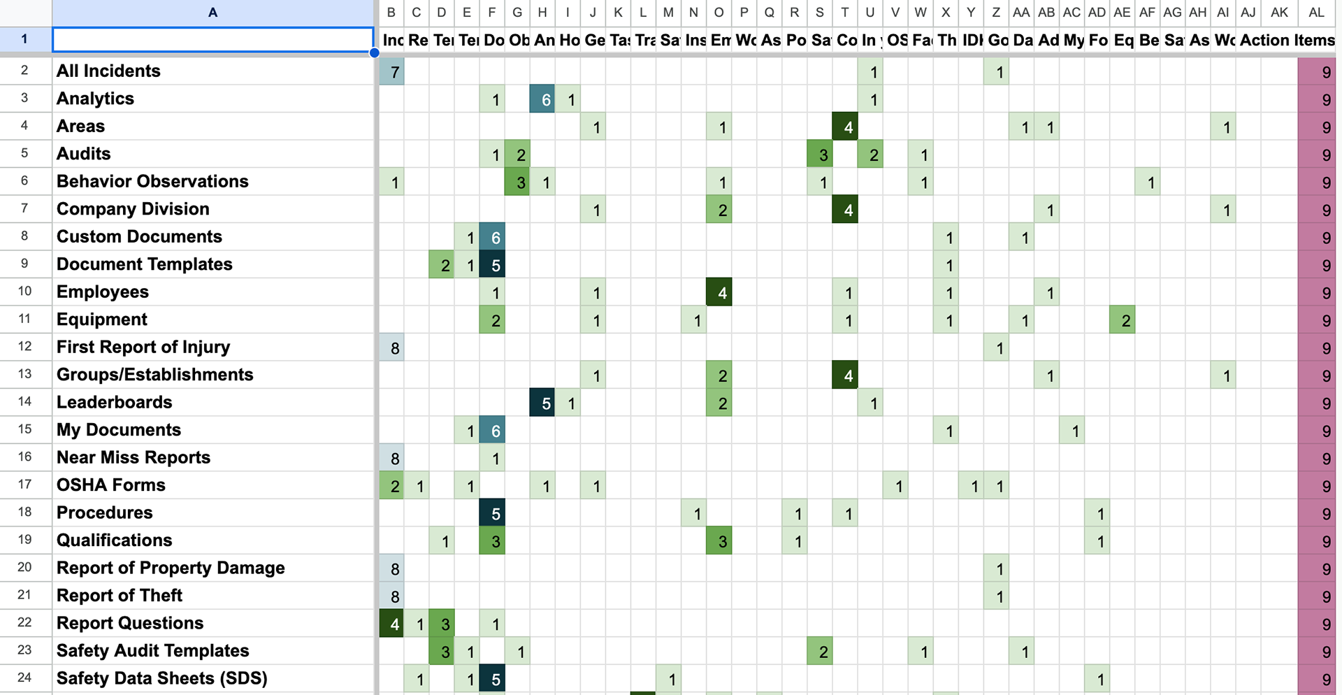
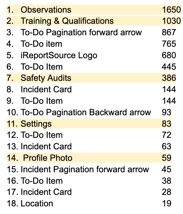
After conducting various types of research I synthesized the data to identify the existing pain points for the users
Explorations
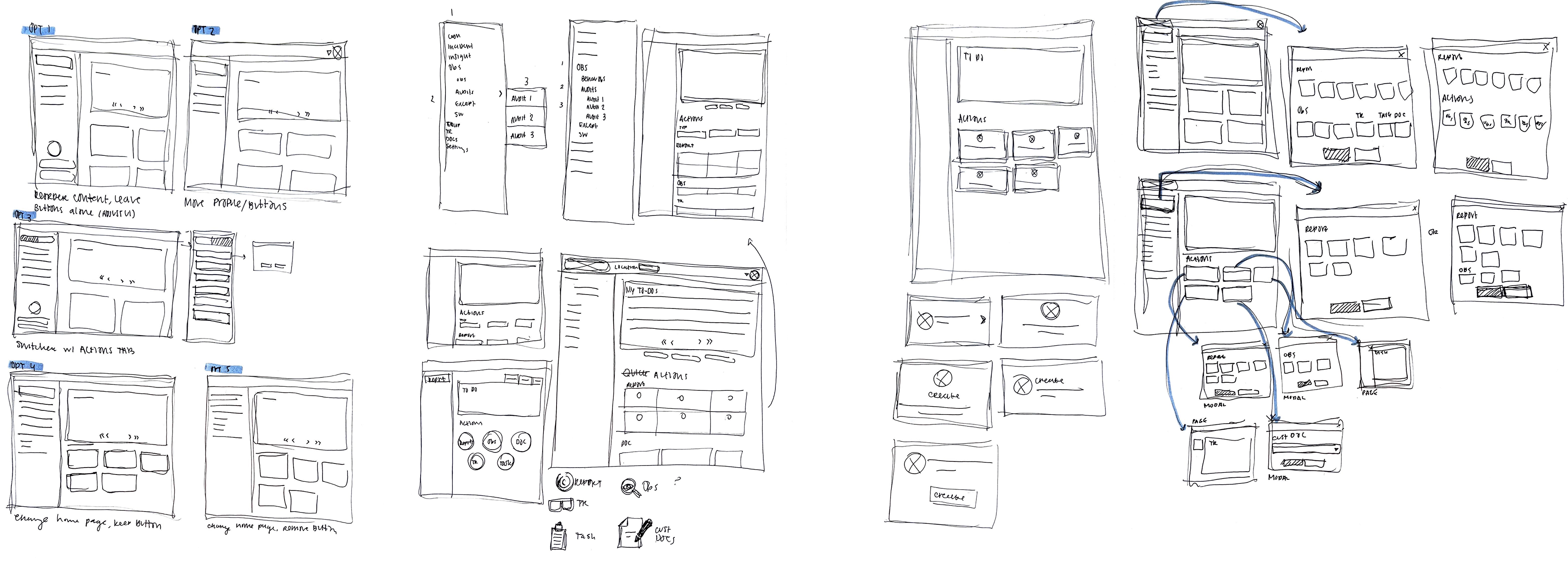
After conducting user research, I began sketching and exploring various options, eventually moving them into the wireframe stage. Based on my research, I decided to continue with a vertical sidebar navigation.
The vertical sidebar navigation was chosen for its quick access and ability to switch between navigation items. It also allowed for scalability as we expanded safety features for our customers. This method interfered the least with the existing page structure, helping to prevent scope creep and the need for a more robust redesign.
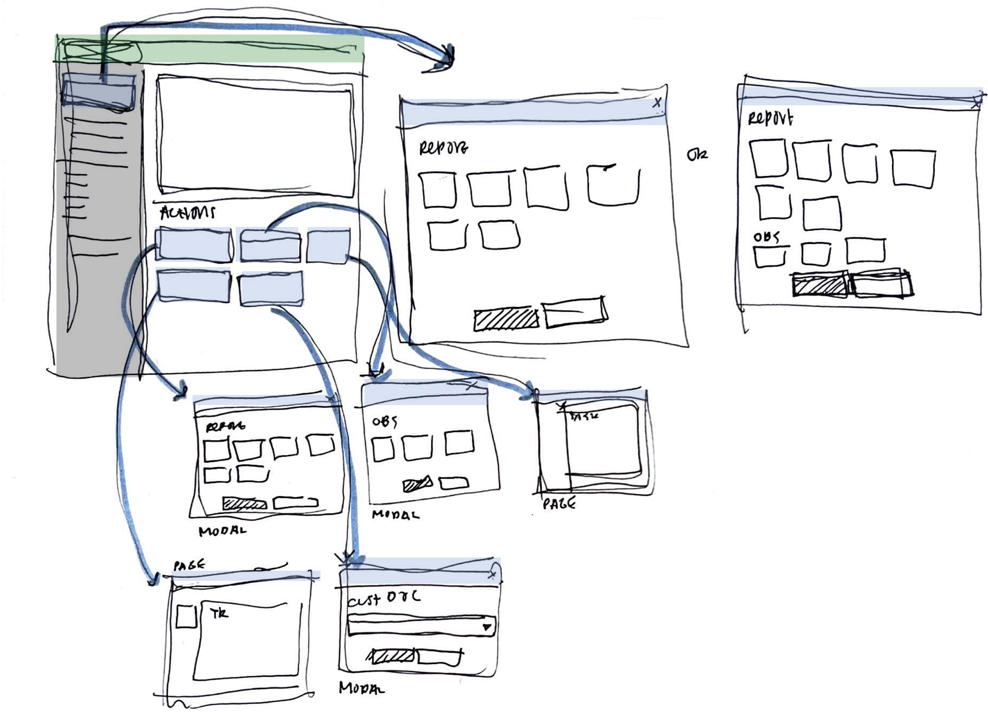
During the research process, another issue emerged: users wanted to quickly create almost anything in the system upon logging in. Previously, this was done with a quick actions button, but it was limited to the reports section of the application. Additionally, feedback indicated that the cards below the to-do list on the original home page were not functional and were not how users typically accessed this information. Therefore, I also explored solutions to this problem.
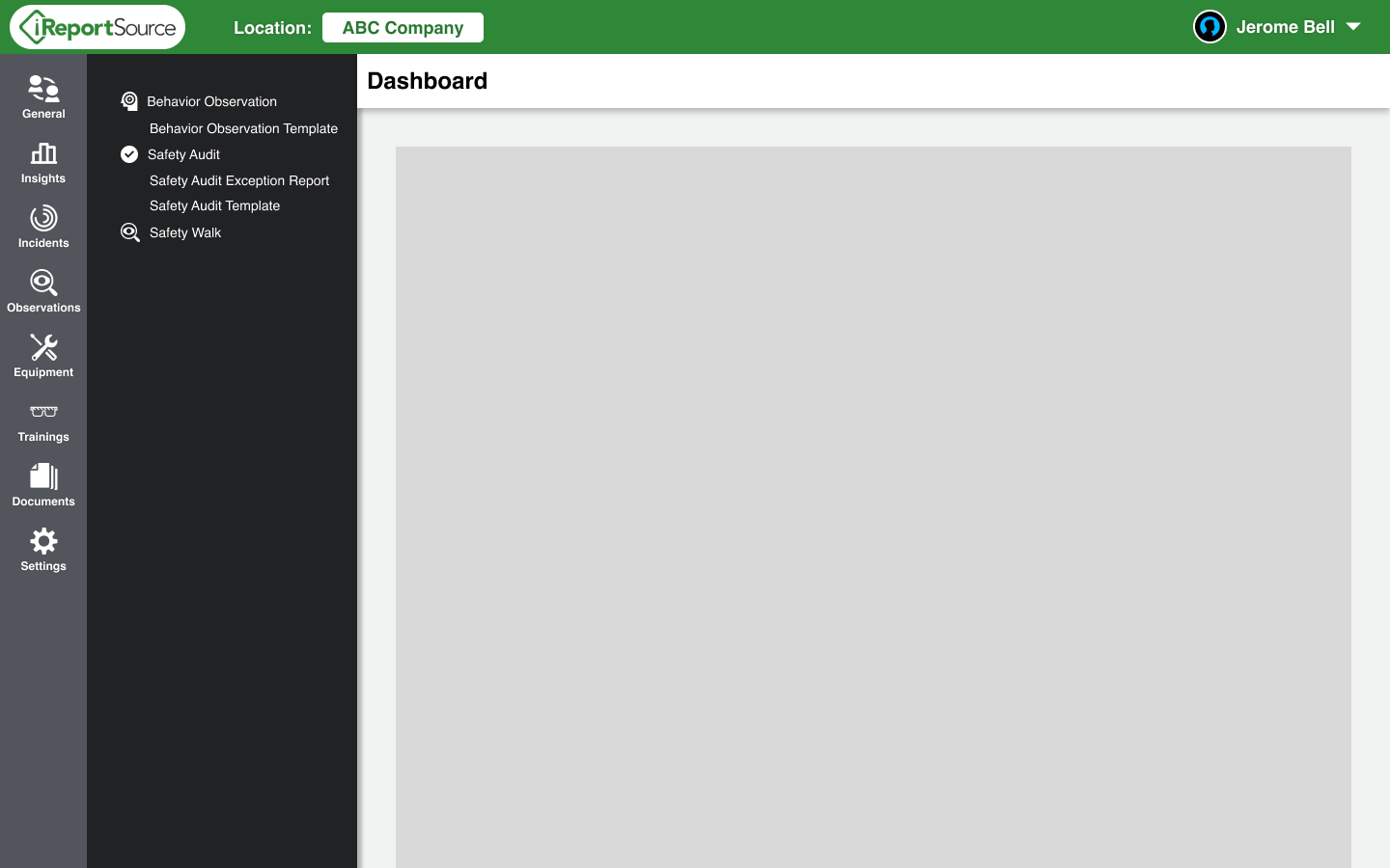
Collapsable left rail
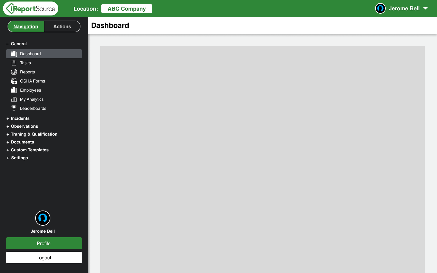
Left rail with tab buttons, on page navigation tab
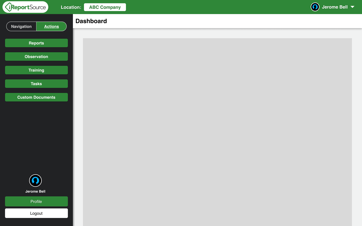
Left rail with tab buttons, on actions tab
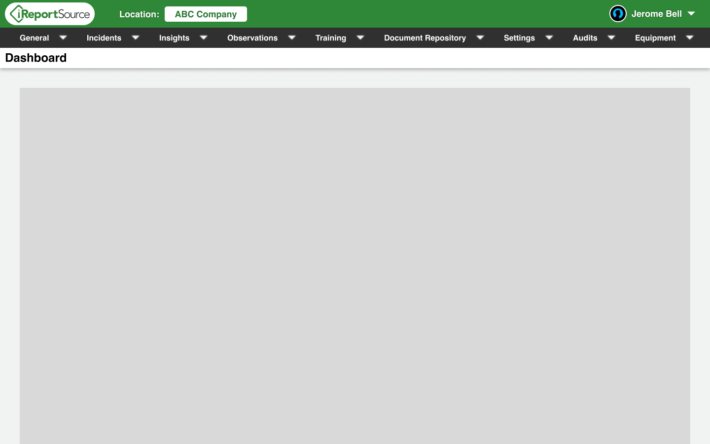
Top rail
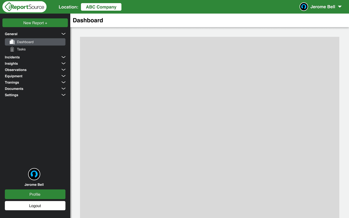
Minor adjustments to existing
Final Designs
Variations of the navigation that accommodate the different user permission levels
Key Changes
Updated the icon set to be more uniform.
Increased emphasis on the active page in navigation to improve user awareness of system status.
Moved the icon for collapse/expand to be more closely associated with the category title.
Relocated user information to the top bar to reduce clutter in the navigation area.
Added quick action buttons to the home page to reduce clutter in the navigation and improve the home page’s functionality for the user.
