Overview
HOMEE is an on-demand home services provider, changing the way homeowners access maintenance and repair solutions. By connecting users with a network of skilled professionals, HOMEE offers a comprehensive range of services to swiftly and effectively address various home-related needs. HOMEE ensures that homeowners can effortlessly schedule and manage service appointments with just a few taps on their mobile devices
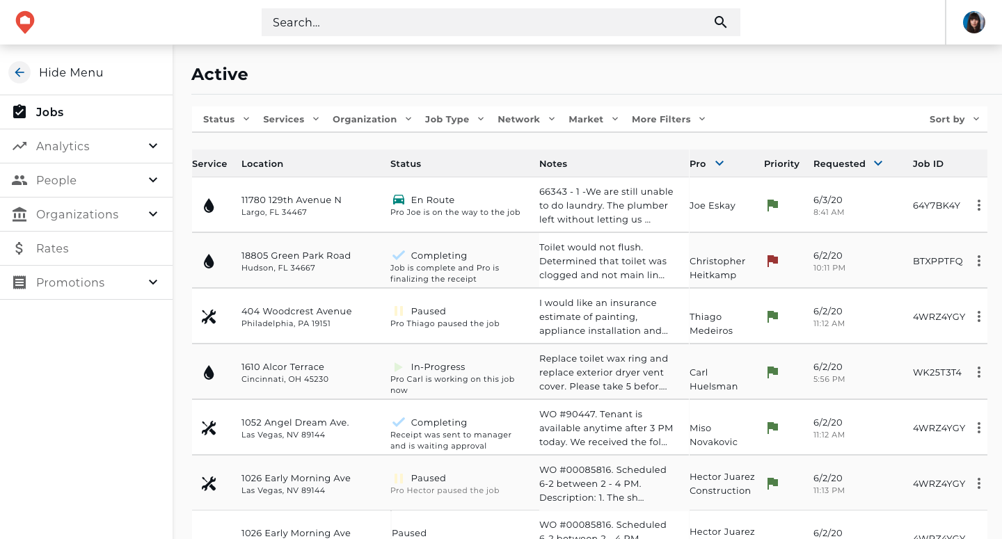
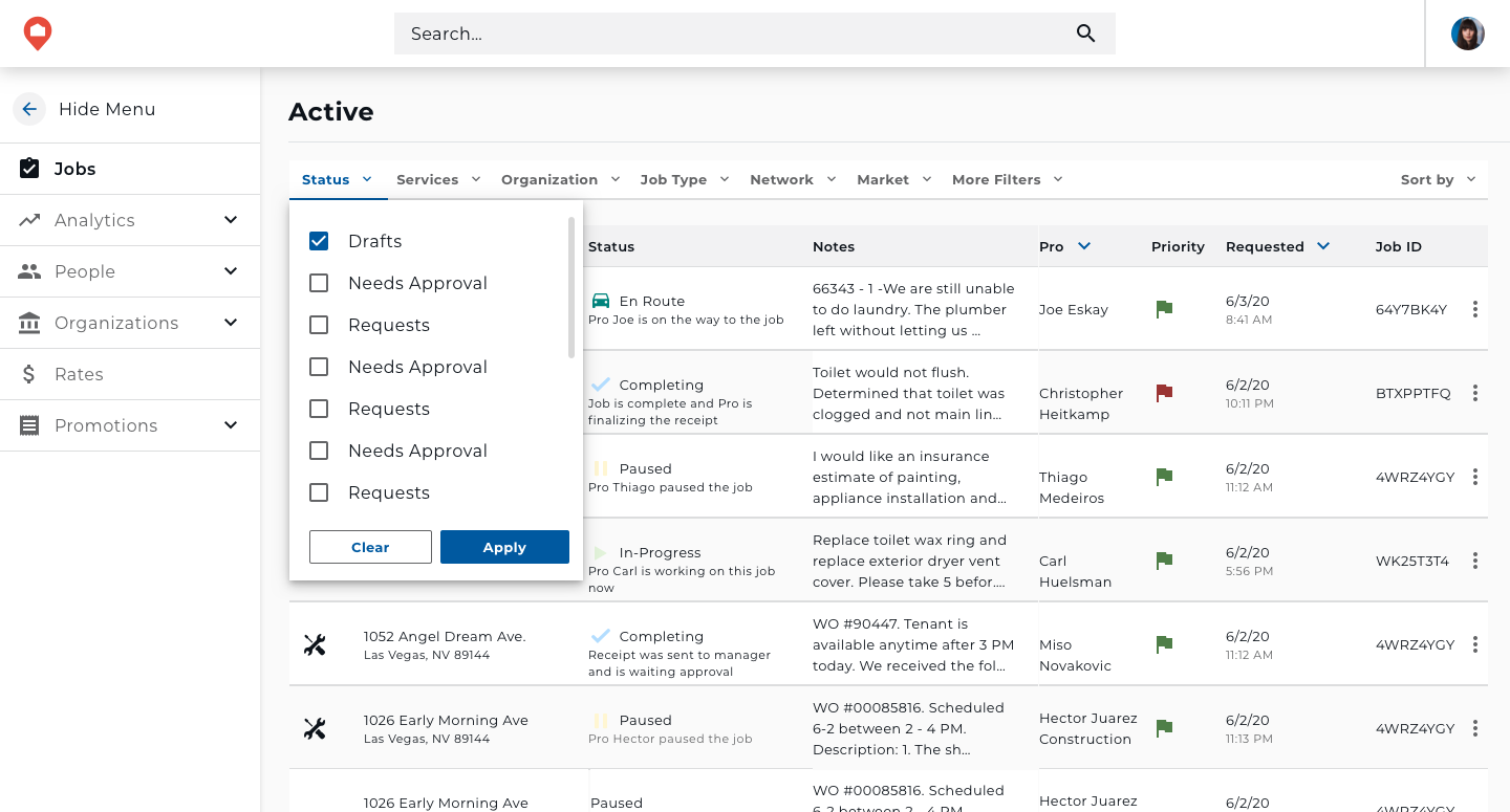
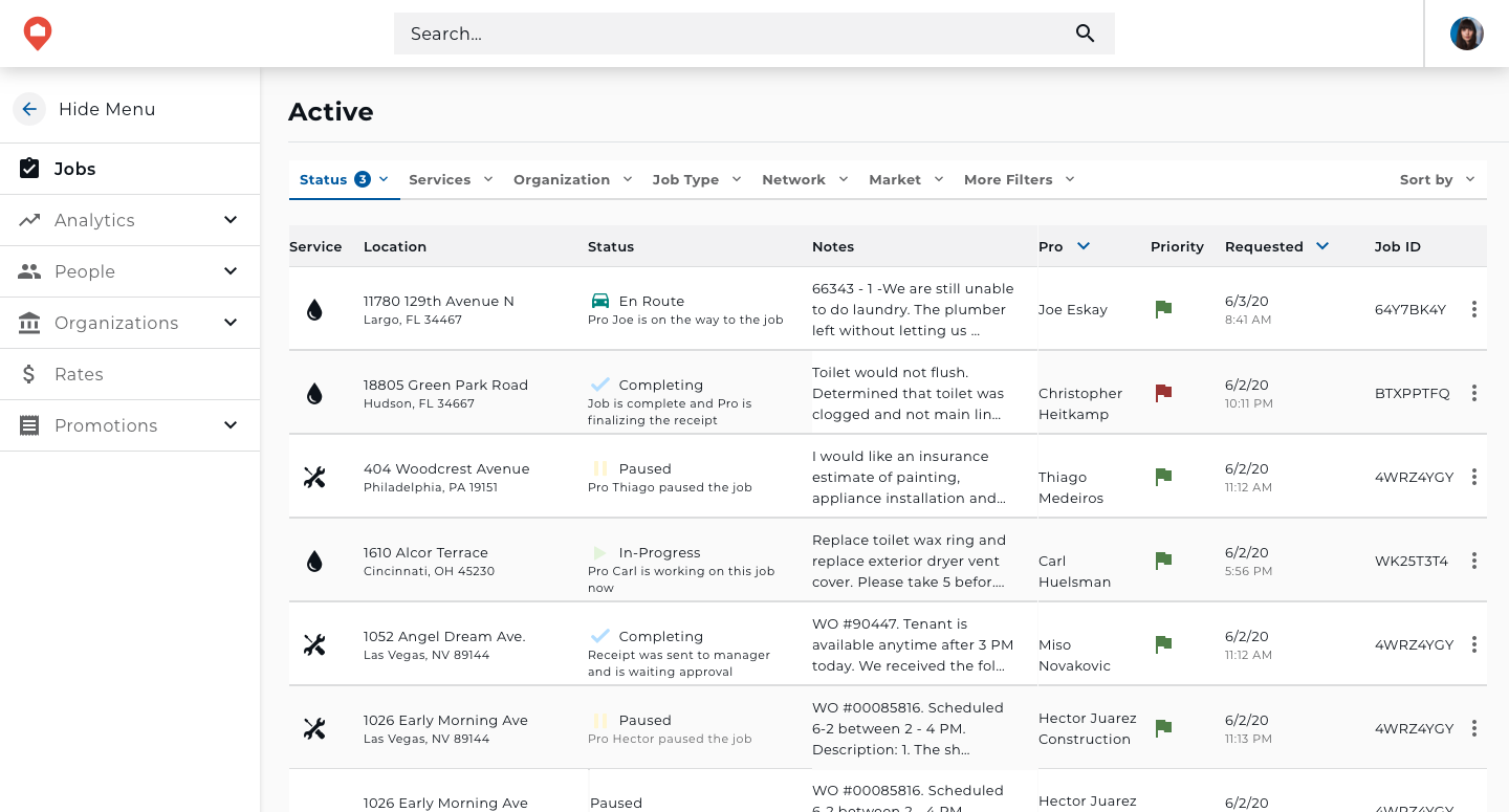
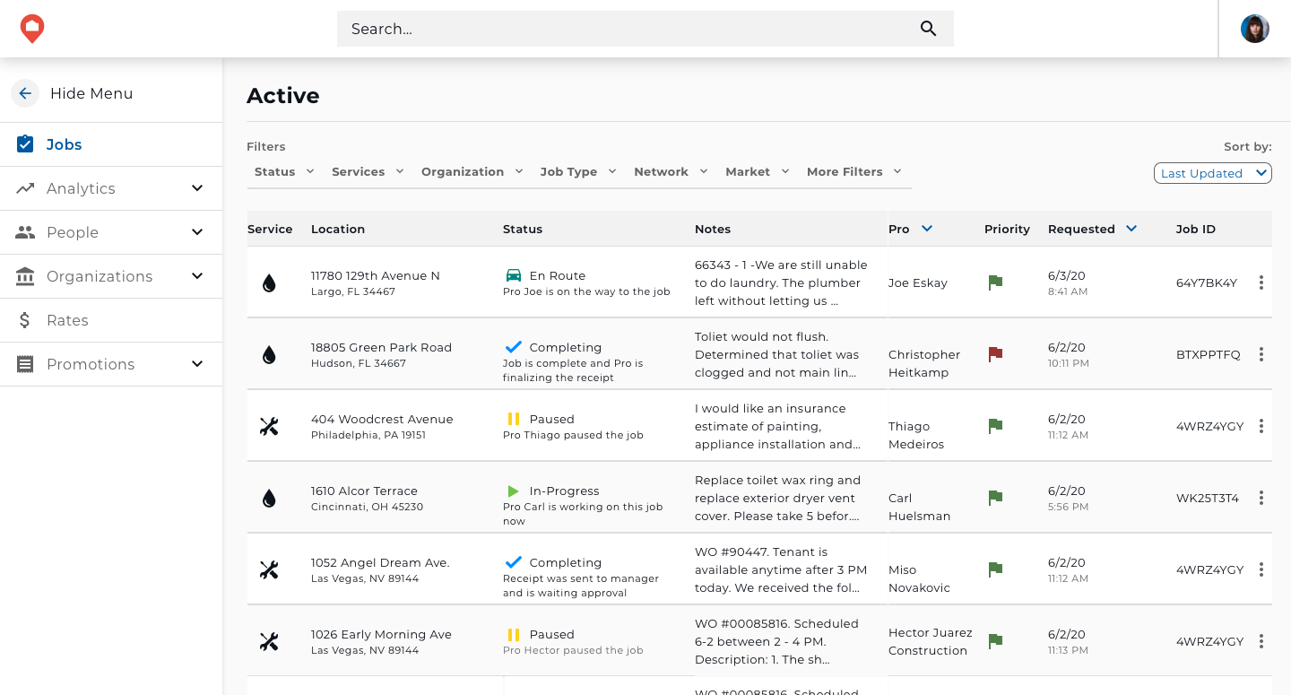
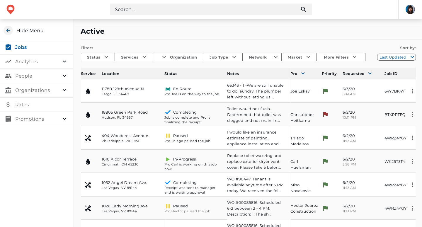
This project delves into the redesign process of table filters, aimed at enriching user experience and bolstering usability. The objective was to review the existing filter system and determine the best way to increase usability and efficiency.
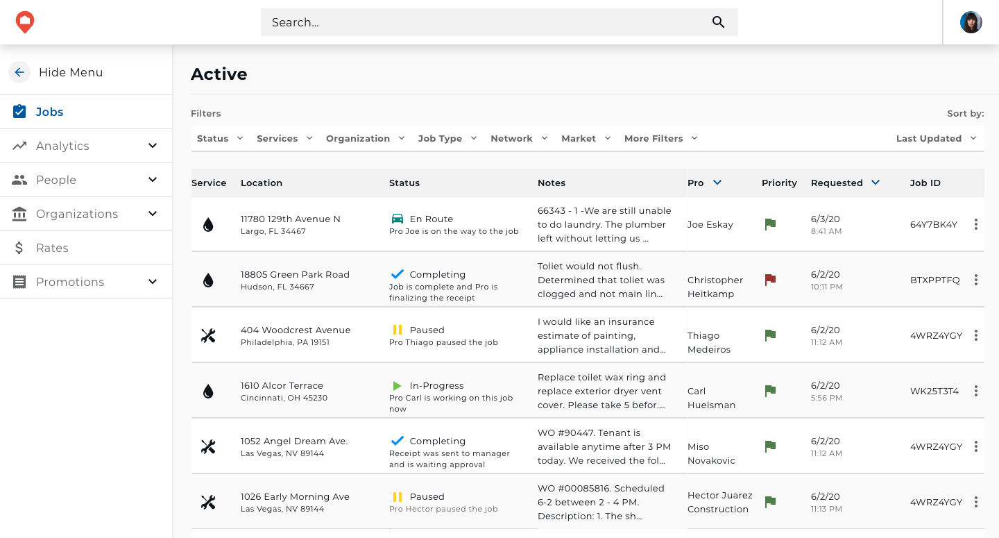
Existing Design

Problem
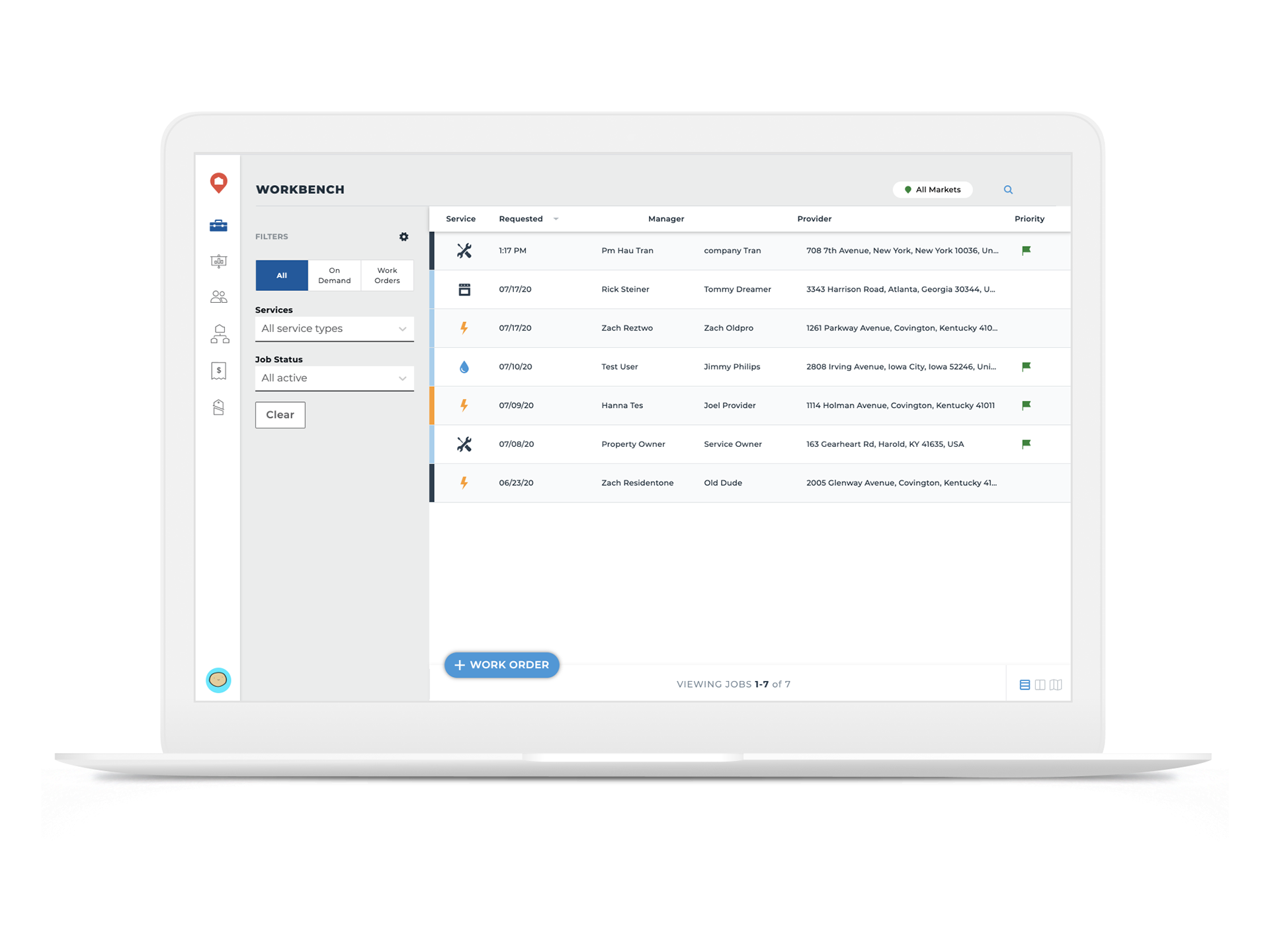
HOMEE, an on-demand home service provider, displays available service jobs in table format. Users encounter challenges locating and tracking specific jobs due to the limitations of the existing filtering system. The current filters lack flexibility, clarity, and interactivity, hindering users from refining their search criteria effectively. The redesign of the table filters in conjunction with a redesign of the jobs table itself aimed to give HOMEE's users a better user experience.
Some issues established with the existing design were that the number of filters was limited, the filters took up too much space on the page which limited what the user could see on the table, and that advanced filters were not clearly displayed to the user.
Process
This project started with a comprehensive benchmarking exercise to review the range of options and the pros and cons of various filtering mechanisms. After evaluating these options, we chose to implement a filter bar at the top of the page. Subsequently, I developed several concepts that underwent critique sessions with the design team before presenting them to the CTO and the developers assigned to the project for feedback.
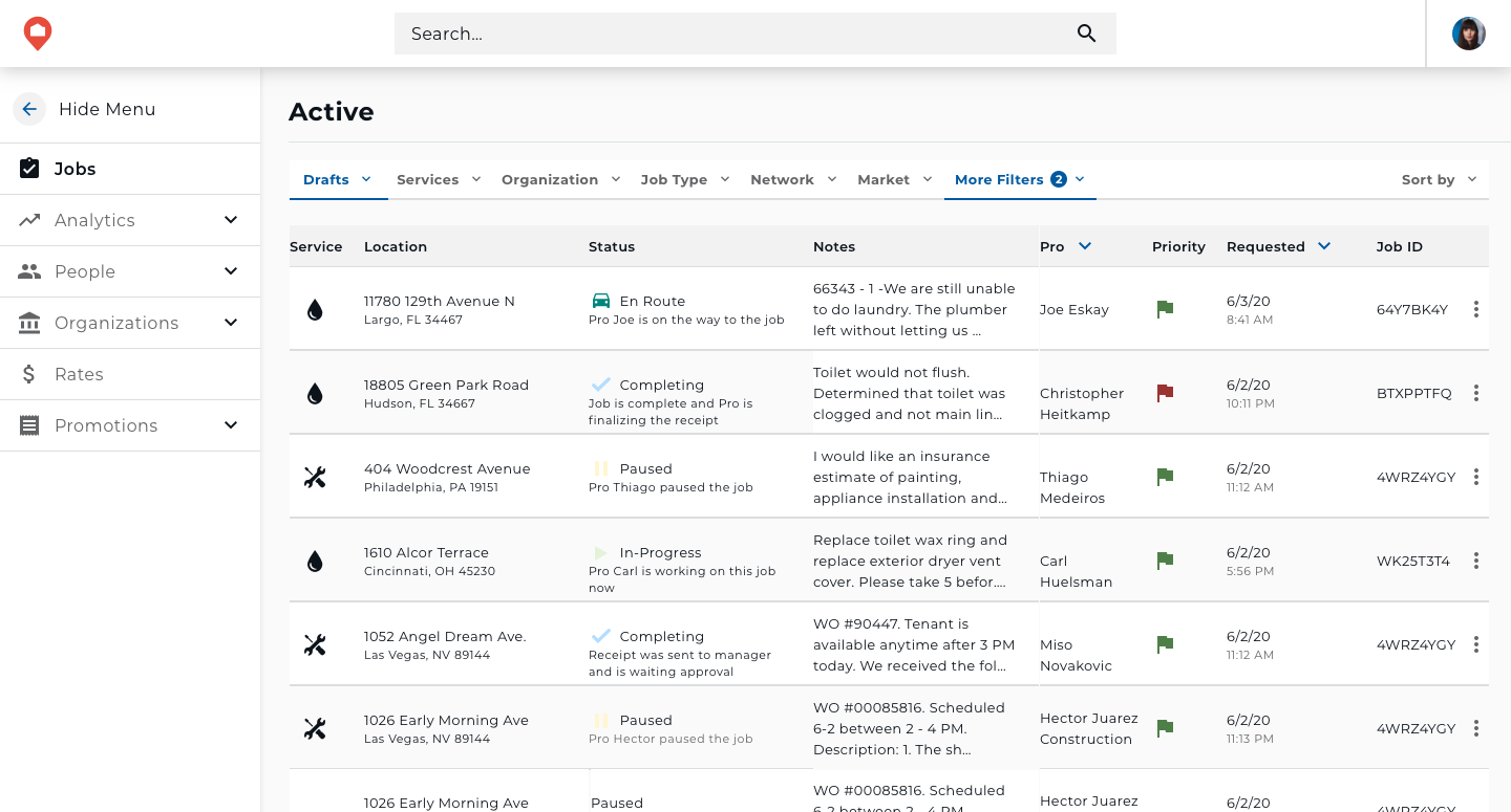

Final
